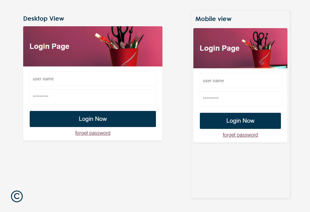
Update:- New tutorial added in HTML section. How to Create Responsive Login Page in HTML without Bootstrap?
Responsive Login Page in HTML without Bootstrap?
View Live DemoIn this tutorial you will learn How to Create Responsive Login Page in HTML without Bootstrap?. Here you will learn this tutorial in easy way.
If you found any difficulty in this tutorial, then you can ask any question by posting comment in comment box or you send message through feedback form.
What we are doing in this tutorial?
- Adding responsive <meta> tag in head tag to make page responsive.
- Adding 2 inputs and 1 button controls.
- Applying the CSS to all controls by creating the class of particular controls.

Step 1.
Open Notepad or other HTML editor which you like. I am using Adobe Dreamweaver. I am suggesting to you use Notepad for better practice.
Step 2.
Now write below HTML coding in your editor to start the base of login page.
	<!doctype html>
	<html>
	<head>
	<meta charset="utf-8">
	<title>Responsive Login Page - Example</title>
	</head>

	<body>

	</body>
	</html>
Step 3.
Now we will add responsive <meta> tag in head section to make our login page responsive so that it will adjust the all screen sizes.
So copy the below <meta> tag and paste it in <head> .. </head> section like next below section.
<meta name="viewport" content="width=device-width, initial-scale=1.0" />
Here you can see how we pasted the <meta> tag in <head> .. </head> section.
	<!doctype html>
	<html>
	<head>
	<meta charset="utf-8">
	<!-- responsive meta tag to tell the browser to adjust the page automatic according to screen size -->
	<meta name="viewport" content="width=device-width, initial-scale=1.0" />
	<title>Responsive Login Page - Example</title>
	</head>

	<body>

	</body>
	</html>
Step 4.
Now will add our main login structure coding in <body> .. </body> section to create the login page.
Copy the below login coding and paste in <body> .. </body> section.
  <div class="container main-container">
	<div class="login-box">
		<div class="header">
			<h2>Login Page</h2>
		</div>
		<div class="login">
			<div class="form-control1">
				<input type="text" placeholder="user name" class="tbox" required />
			</div>
			<div class="form-control1">
				<input type="password" placeholder="*********" class="tbox" required />
			</div>
			<div class="form-control1">
				<input type="submit" value="Login Now" class="btn" />
			</div>
			<div class="forget-box">
				<a href="#" class="link">forget password</a>
			</div>
		</div>
	</div>
  </div>
Here you can see how we pasted the login code in <body> .. </body> section.
 <!doctype html>
	<html>
	<head>
	<meta charset="utf-8">
	<!-- responsive meta tag to tell the browser to adjust the page automatic according to screen size -->
	<meta name="viewport" content="width=device-width, initial-scale=1.0" />
	<title>Responsive Login Page - Example</title>
	</head>

	<body>
	<div class="main-container">
	<div class="login-box">
		<div class="header">
			<h2>Login Page</h2>
		</div>
		<div class="login">
			<div class="form-control1">
				<input type="text" placeholder="user name" class="tbox" required />
			</div>
			<div class="form-control1">
				<input type="password" placeholder="*********" class="tbox" required />
			</div>
			<div class="form-control1">
				<input type="submit" value="Login Now" class="btn" />
			</div>
			<div class="forget-box">
				<a href="#" class="link">forget password</a>
			</div>
		</div>
	</div>
    </div>
	</body>
 </html>
Step 5.
Now apply the CSS to all Elements for better presentation. First create CSS <style> .. </style> tag in between <head> .. </head> tag like below.
    <head>
    <style type="text/css">

    all css code come here....

    </style>
    </head>
Now copy the below CSS code and paste it in between <style> .. </style> tag.
	body{background-color: #f5f5f5; font-family: Arial;}

	.main-container{display: flex; justify-content: center;}

	.login-box{border-radius: 4px; background-color: #fff; width: 450px; box-shadow: 0 .125rem .25rem rgba(0,0,0,.075)!important; margin-top: 50px;}
	/*.....note:-  we have added image link to header ......*/
	.header{background: url(http://kkarjun.com/Nature/pencil-09.jpg) center #d14269; background-size: cover; height: 130px;
		border-top-left-radius: 4px; border-top-right-radius: 4px; display: flex; justify-content: flex-start; padding-left: 20px; align-items: center;	color: #f5f5f5;}

	.tbox{width: 97.33%; height: 45px; padding-left: 10px; border-radius: 3px; border: 1px solid #f1f1f1; margin-bottom: 10px; outline: none; font-size: 0.9rem;
	 transition: 0.6s; color: #333; }

	.tbox:focus{border: 1px solid rgba(209,66,105,0.36); transition: 0.6s; color: #d14269;}
	.login{margin: 15px 20px;}

	.btn{border: 1px solid #f5f5f5; width: 100%; padding: 15px 0; border-radius: 4px; margin-top: 10px; margin-bottom: 10px;
		background-color: #033551; color: #f5f5f5; font-size: 1.2rem; outline: none; transition: 0.6s;}
	.btn:hover{background-color: #333; transition: 0.6s;}

	.forget-box{text-align: center;}

	.link{color: #75334e;}
Step 6. Final Step
Now save your page with any name with .html extension. Like responsive-login-page.html. After saving the file, open the file by double clicking on it and see your final output.
View Live Demo